


By Katrina Olson
 The last of the “big three” tools in the graphic designer’s toolbox is typography—the art and technique of arranging words on a page to convey a desired look and feel in an ad, brochure, flyer, catalog, website, flyer, blog or other communication piece.
Typography—the font or typeface, size, capitalization, weight (thickness) or special treatments (i.e. bold, italic, outline)— is both functional and aesthetic. It needs to be legible, readable and attractive; and it needs to work with your design.
It’s easy to default to Times New Roman, which American Typographer Matthew Butterick says, “…is not a font choice so much as the absence of a font choice, like the blackness of deep space is not a color.”
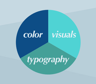
However, by experimenting with typography, you can breathe new life into a case study or brochure. Font choices are as much a design element as color or visuals. As German designer Helmut Schmid said, “Typography needs to be audible. Typography needs to be felt. Typography needs to be experienced.”
Consider how the following fonts make you feel and where you might use them:

Okay, these were pretty obvious. Fortunately (or unfortunately), many large, established companies have branding guidelines or corporate identity standards that dictate specific fonts and provide logos to be used in all marketing materials.
However, for an independent company choosing a corporate font or updating a logo, the almost unlimited number of font choices makes it more complicated. In this case, it’s best to call in a graphic designer.
Whether you’re designing your logo or materials in-house, or working with a freelance graphic designer or agency, these tips will help you make good design choices.
Choosing and Using Type
Following are a few conventions and guidelines for using type in your marketing materials.
Choose an appropriate font.
Some fonts—like Goudy, Palatino and Garamond—are considered “Old Style.” They are are classic, traditional and readable. Others are more modern—like Bodoni and Didot—and are strong, stylish and dynamic. Sans-Serif fonts are based on geometric shapes and are minimalist in design. These fonts—which include Helvetica, Univers, Futura and Avant Garde—are clear and objective; but they can also come off as cold, impersonal and boring.

https://visualdesignstudio.files.wordpress.com/2011/07/typography_poster_by_kidcasanova.png
When considering your options, choose a font that:
- best reflects the personality and brand of your company;
- reproduces well in various sizes and applications (print, web, etc.); and
- offers a variety of options (bold, italic, condensed, narrow, expanded, etc.)
Once you’ve chosen a font, stick with it. This will give your materials a consistent look and feel (along with consistent use of color and images).
Pick one: correspondence or contrast.
Correspondence and contrast are general principals of design. Correspondence means things look good together because they are similar. Contrast means they are so different—and sufficiently different—that they look good together.
Contrast: Garamond & Helvetica
Correspondence: Perpetua & Gill Sans
Garamond and Helvetica work together because they are so noticeably different. Garamond is an older style font with “serifs” (a small line attached to the end of a stroke in a letter) while Helvetica is a more contemporary font with no serifs.
Perpetua and Gill Sans work together because they are similar in style. If you look at the entire alphabet for each, you’ll notice the a, m, n, r and t in both fonts are very similar. To achieve correspondence, graphic designers will often choose fonts from the same time period, with the same height or weight, or from the same designer.
If that’s too complicated, opt for contrast. Choose one san serif (font without serifs, such as Gill Sans) for headlines, short copy and web copy; and another serif font (like Garamond or Palatino) for body copy in brochures, ads and other long documents.

Notice that this ad uses a serif font for the headline and a san serif font for the body copy. On a related note, for years we’ve heard that serif fonts are easier to read than san serif fonts. But recent research has debunked this myth. If you’re fascinated by this debate or want to win an argument with your fellow designers or boss, see this blog: https://alexpoole.info/blog/which-are-more-legible-serif-or-sans-serif-typefaces/#part2
Follow the “less is more” principle, especially with display fonts.
Remember those funky fonts from the beginning of the article? They’re called display fonts. They’re cute and kitschy and would look adorable on your kid’s birthday invitation. But use them sparingly in business… or not at all.
Obey the rules… or don’t.
 Fonts literally come in all shapes and sizes; some have thick lines; some have thin lines. Some are narrower, taking up less space; others are wider, taking up more space. Some are older; some are more contemporary. Some are taller and some are shorter.
Certainly, there are guidelines and conventions about using type. But if you follow them, your pieces will look like everyone else’s. Talented designers know and understand the rules and why they exist—and they know how to break them and still make a piece look good.
—
Olson is a veteran marketing and public relations consultant. She has written for tED magazine’s print edition since 2005, judged tED magazine’s Best of the Best Competition since 2006, and emceed the Best of the Best Awards ceremony for a total of seven years. Reach her at katrina@olsonmarketing.net or at olsonmarketing.net.
Tagged with tED